THE POWER OF REBRANDING: THE FINAL ISSUE
We’ve finally made it to the end of The Power of Rebranding! Sadly, this series is coming to an end but we couldn’t think of a better way to cap it off than with the re-imagination of an ad.
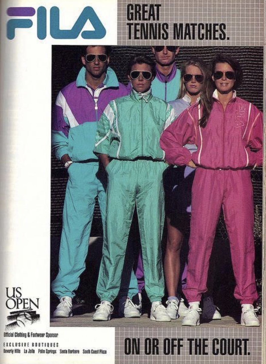
Last week we asked all of you how you would re-imagine the following Fila ad in the tone and mood of modern society
We loved all of your submissions but we had to pick the one we feel went best with how society is at the moment. Without further adieu the winner is *drumroll*
Maybe just keep the photo, add the logo and a phrase
We didn’t want to leave you guys hanging so as an extra special surprise we turned the winning suggestion into an actual poster 😜
We removed the busy text and background and kept it minimal. We added more modern anti-design factors like the different shapes and colors that you find towards the middle part of the photo. Lastly, we decided to go for a sans-serif font as to not to overload the viewer given that the background is already very busy.
Before we go, we wanted to take a quick moment to thank all of you that have come back each week to tune in to The Power of Rebranding, it truly has been an amazing journey. If you liked this series, you can download the file here! ‘Til next time! ☺️
Do you want to rebrand after reading this series?
Click HERE to get into contact with our team and create your new you!


