

THE POWER OF REBRANDING VOL. 3
The wait is over! Here is this week’s The Power of Rebranding! A series of articles on graphic design, marketing, and everything in-between! This week we take a look at the marketing side of things. Specifically, the marketing communications of three brands; Burger King, Apple, and Johnnie Walker and how they have stood the test of time by adapting their communications strategy and design.

Marketing communications and their importance
Marketing communications is the combination of messages and media that a company uses to communicate with their target audience. Due to the recent shift towards digital channels such as social media, companies have started to get creative with their communications. While you can still see physical posters or out of home (OOH) ads, most companies are now leveraging graphic design for sharing on numerous digital platforms. Given this shift, we see more and more brands adapting to current trends in graphic design, social media, and society in general.
Brands that have gone through their brand metamorphosis
In this volume of The Power of Rebranding we take a look at three brands and how they have changed their brand positioning through their communications by adapting to the graphic design trends at the time.
Burger King
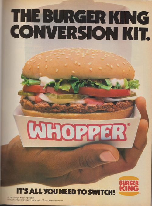
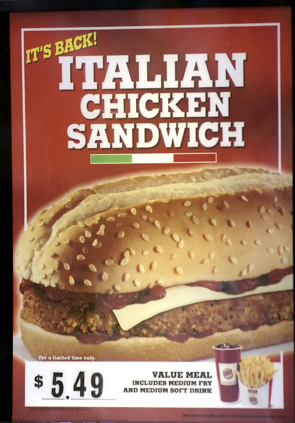
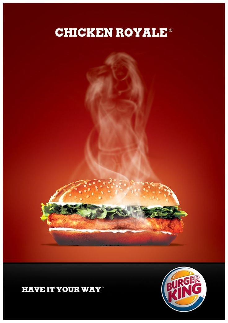
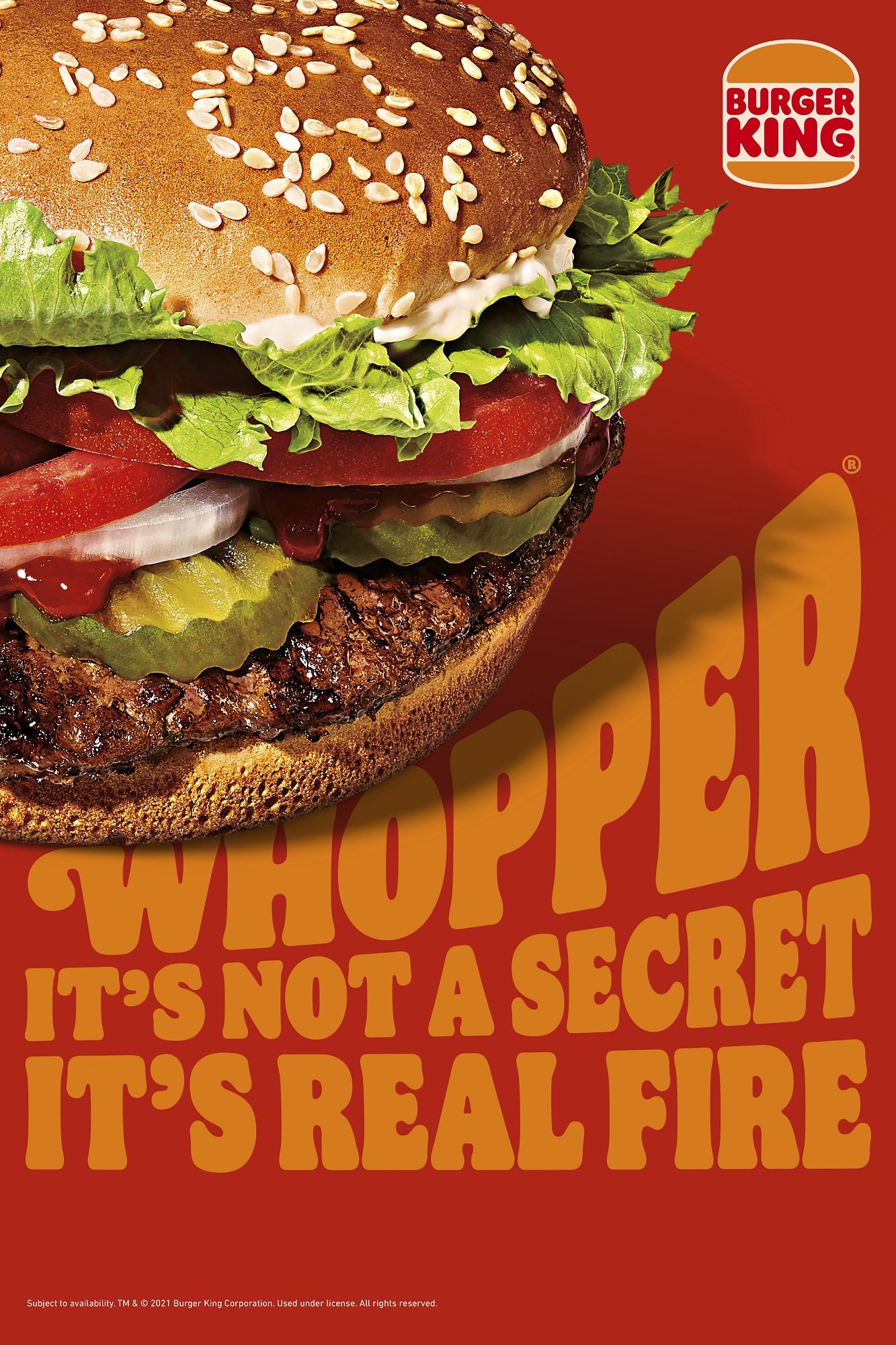
Burger King is a brand that we should be familiar with. Since it’s opening in 1954, Burger King has been through multiple brand re-imaginations. As one would imagine this also meant that their marketing communications had to be adjusted as well. As you go through the carousel below, you will see some of the previously discussed graphic design trends in each image. For example, in the first picture we see the retro style of the fonts that were prominent in the 80s or in the second image we see the use of drop shadows with the font design which was characteristic of the 2000s. Needless to say, it is clear that Burger King has been adapting itself to the graphic design trends, which is one of the reasons that it has been able to stay relevant for so long.
Apple
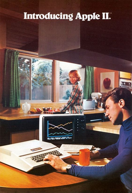
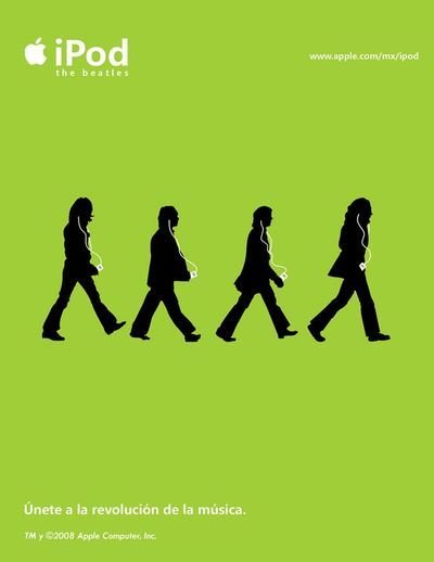
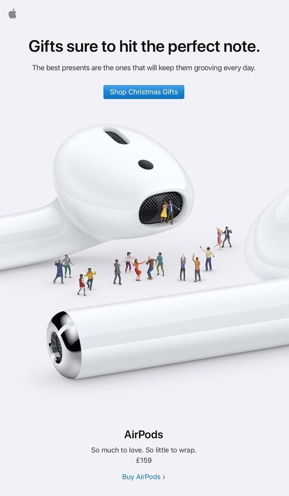
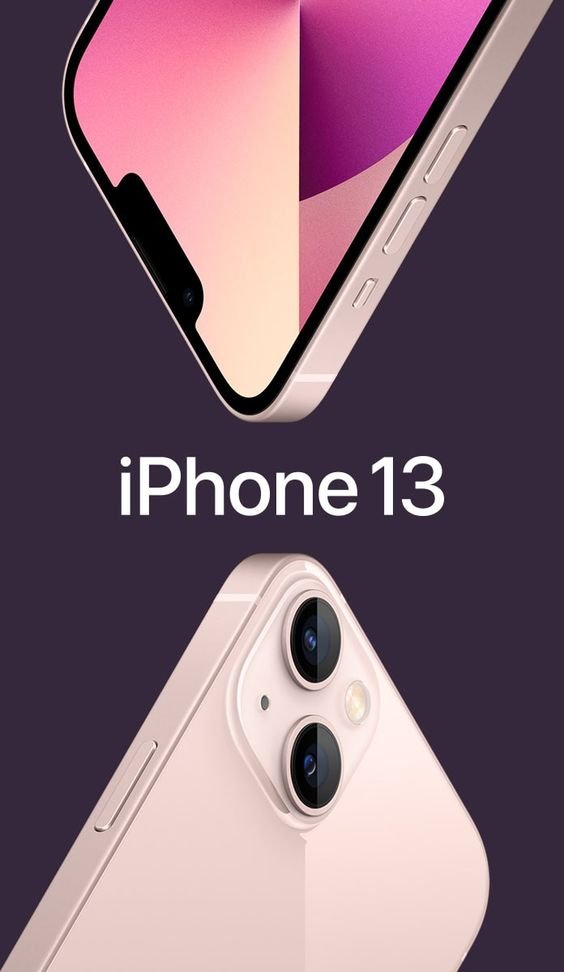
Apple is one of the top tier brands. But why is that? How did they earn this long standing status? It is through their very effective communications. They were able to achieve strong relationships with their consumers because they were able to distinguish what exactly their consumers needed, which they update year on year in order to keep fulfilling this need. But, if they are unable to properly communicate the updates that they release every year then it would be harder for them to expand their market share and win over more clients. That was never a problem for Apple, as one may notice in the photos below, Apple is constantly putting together graphic design and cultural trends in order to create a larger impact on the viewer. For example, in the 2000s they released their classic iPod single color ads, however, you could also take note of their use of a sans serif font, which is was popular in the 2000s. In their more recent ads, we may take note of the use of 3D characters and a lean towards a classic simple design, which is Apple’s stronghold.
Johnnie Walker
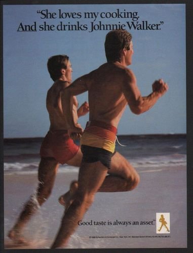
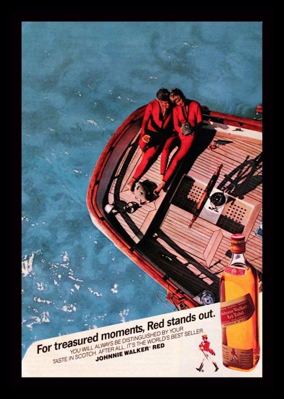
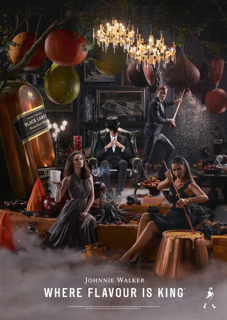
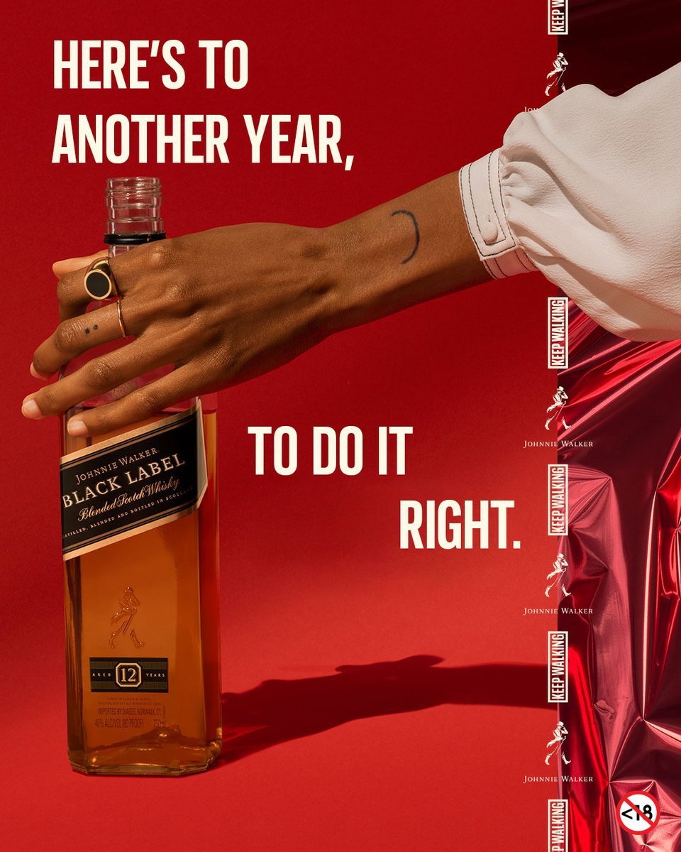
Johnnie Walker is one of the longest standing brands of all time. After its beginning in the late 1800s, Johnnie Walker has definitely been through the test of time, and spoiler alert, they won. Johnnie Walker has always been known for its thought-leading marketing strategies. The best example of this is by setting the scene in which they want the user to feel when they are consuming their product. They tie in different consumer moments with a different product in their product line. In fact, my own father jokingly told me that “nothing is more satisfying than being able to continuously upgrade your bottle of Johnnie" because as you progress through life it is something that you get to continuously upgrade as well. Aside from this symbolism we also see how Johnnie Walker makes use of appealing visuals to maximize the connection that they want to make between the consumer and the moment of consumption. For example, in the first image we see the use of serif fonts and in the second image we see how they use very bright saturated colors both of which were distinctive of the 80s. In the later years we see how they start mixing in the use of technology to generate 3D objects and shadowing and playing around with more textures.
All images used are from pinterest.com
Does your company need a brand metamorphosis?
Click HERE to get into contact with our team and enter into your new era!
That's it for this issue of The Power of Rebranding! :) Tune in next week for a fun closing challenge