

THE POWER OF REBRANDING VOL. 2
Welcome back to The Power of Rebranding! A series of articles on graphic design, marketing, and everything in-between! This week we take a look at why graphic design changes, the cultural factors and distinct styles from the 1980s to the present, and examples of ad campaigns that showcase the graphic design styles from those decades! Let’s get started!

Why Does Design Change Through The Decades?
Seeing as art is often a reflection of society and culture, it does not come as a surprise that graphic design adapts itself to fit how society is in a certain moment in time. These changes are reflected in parallel with famous art movements such as:
Bauhaus

Photo: Louis Held, ca. 1906. Gelatin silver print. 15.5 x 22.2 cm. Bauhaus-Archiv Berlin, 6677
Bauhaus is an influential art and design movement that began in 1919 in Germany. This art style incorporated minimalism, geometric shapes, and simple typography.

Photo: Bauhaus inspired posters by pikisuperstar
Art Deco
This art movement initially was created as a celebration in Paris in 1925. Art deco was focused on stylish, elegant, and sophisticated works, which it achieved by pairing unique geometrically stylized forms with man made ornaments. It was all about untraditional elegance. This movement became so popular that it was even incorporated into architecture!

The Chrysler Building in New York, USA by Reza Shokri
Pop Art
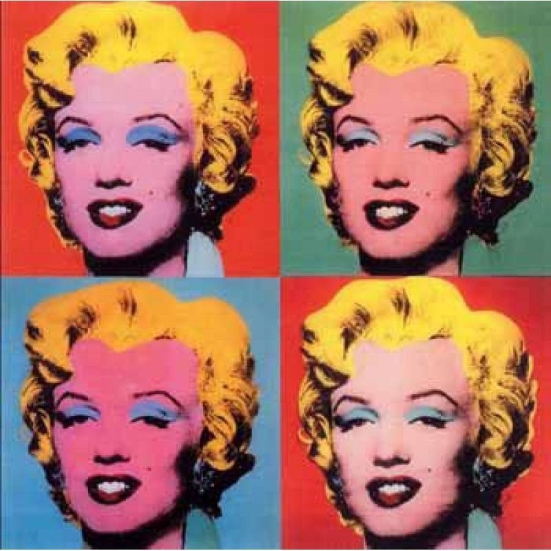
Shot Marilyns by Andy Warhol
This art style is most often associated with the famous artist Andy Warhol. Warhol was known for fully embodying this art movement. That is, he was often perceived as the ultimate glorifier of pop culture. Pop art occurred primarily in America and England during the 1950s-60s. It boasted loud colors and shapes. It was all about using what was in to send a message.
These are just a few of the numerous art movements that we have seen over time. Given that Graphic Design is a modem of expressive art, it is not surprising that graphic design often represents society and the trends that are present at the time. In this next section we will be looking at each decade of graphic design beginning with the 1980s.
1980s
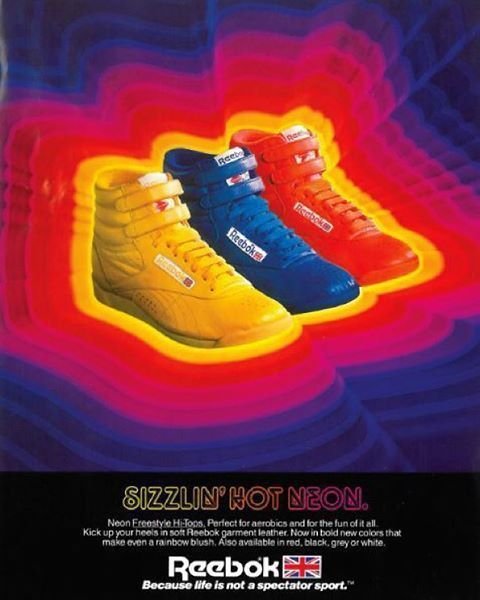
The 1980s was the decade of boom and excess, punk culture, disco, and sci-Fi pop culture. Some important cultural factors during this decade were that the TV industry grows exponentially during this decade and music goes visual with the introduction of MTV. Fashion was experimental (there were almost no rules!). Nervous emotions were also looming, as fear of a nuclear war was hanging above the heads of the people.
With all of these factors in mind, it does not come as a surprise that graphic design during this decade were characterized by:
Out of the norm designs
Disco typography
Anarchic use of color
Serif fonts with neon color palettes and jumpy grids
Neon saturation
Shiny chrome
Synth wave art
3D Shapes
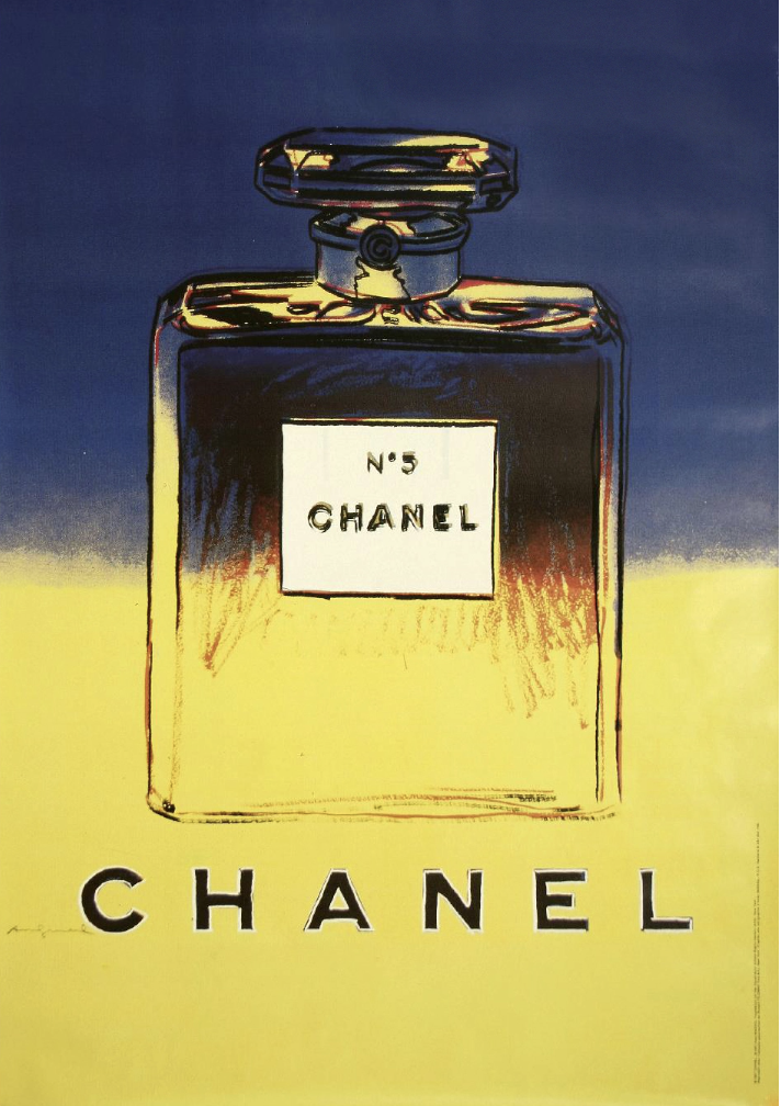
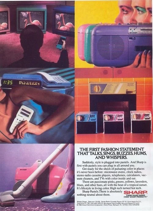
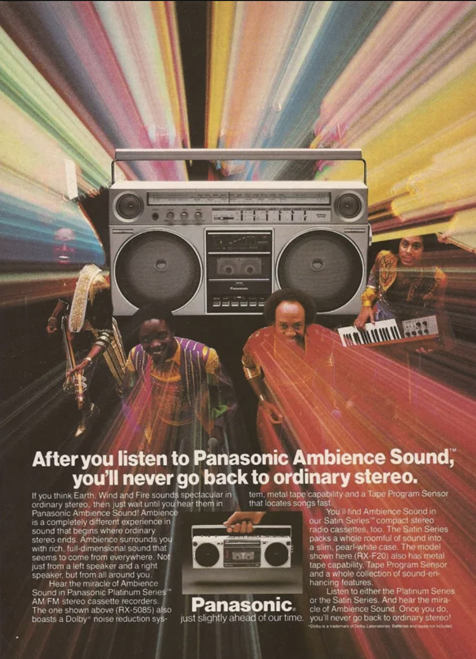
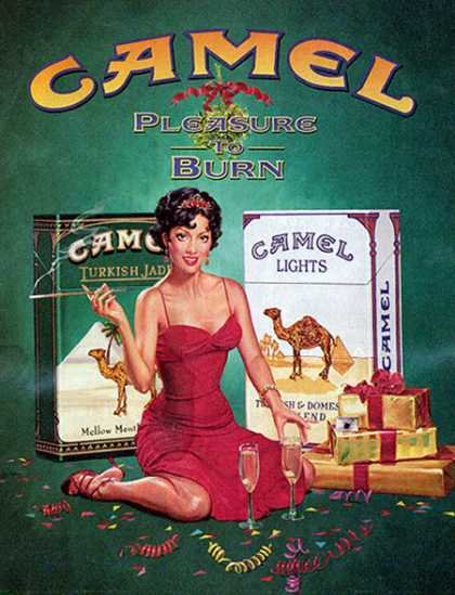
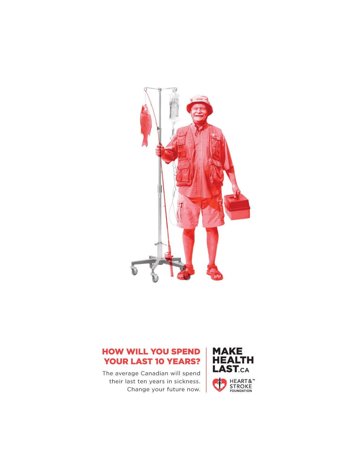
Examples of Ads from the 1980s
1990s
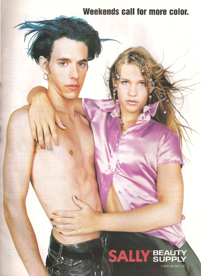
The 1990s were known for when digital design technology started to evolve and be made available to everyone. This occurred when Microsoft introduced Paint to the general public. Suddenly, almost everybody had access to a modem to make art. This only developed further when Adobe Photoshop released in 1990 broadening the horizons even more for the general public. In terms of culture, the 90s is often renowned as the Golden Age of Multiculturalism and with it, alternative styles. Music styles like grunge, the rave scene, and hip hop became popular amongst young people around the globe.
Thus, the 90s distinct art style was born. Art from this decade often included:
Grunge: Collage style and edgy photography
Warm Color combinations (Fuchsia, Teal, Yellow, Orange, and any warm color)
Blocky fonts with strokes and shadows
Pattern based
Minimalism (towards the end of the decade)
Examples of Ads from the 1990s

2000s
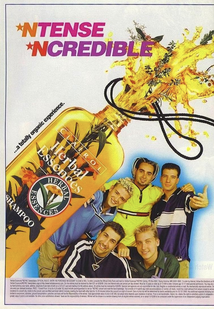
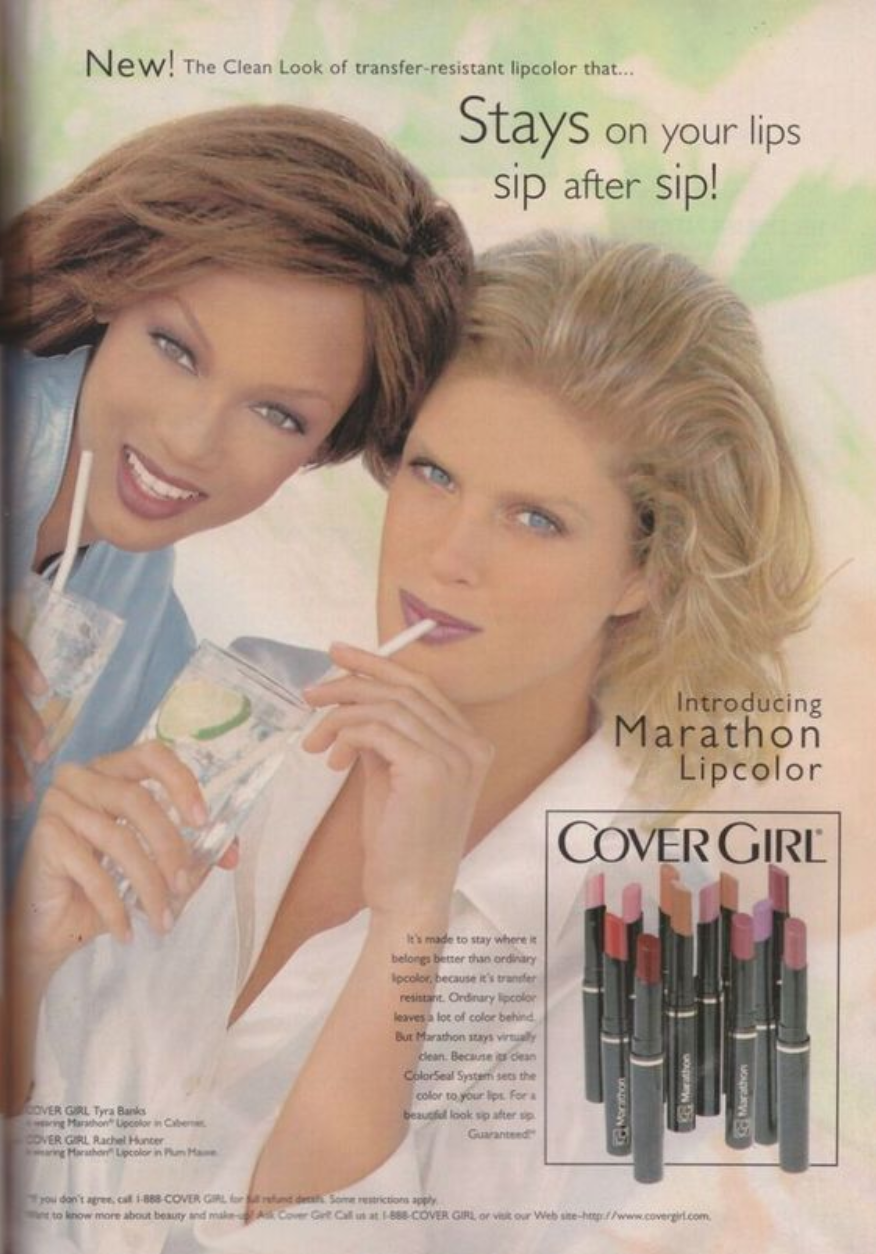
If what you are about to read sounds familiar to you, it might be because this is the decade that the present day Y2K movement draws inspiration from. Where the 80s and the 90s were known for their experimental and sporadic designs, the 2000s started being more uniform in terms of design. Branding was at an all time high with companies like Google, Twitter, and Facebook opening their doors and creating their own company specific art styles. Computer-aided design was no longer an option but a necessity, technology was developing rapidly and with it so did graphic design methods. The popularity of mobile phones presented opportunities for companies but also forced them to optimize their communications for mobile viewing. Last but not least, who can forget the famous housing bubble crisis of 2008 that had adverse effects on a global level.
The 2000s were a turning point for people, companies, and graphic design. Art from this decade could be recognized by:
Political and Social propaganda
Sans Serif
Typography manipulation started
3D Designs
Drop shadows
Sleek thin fonts
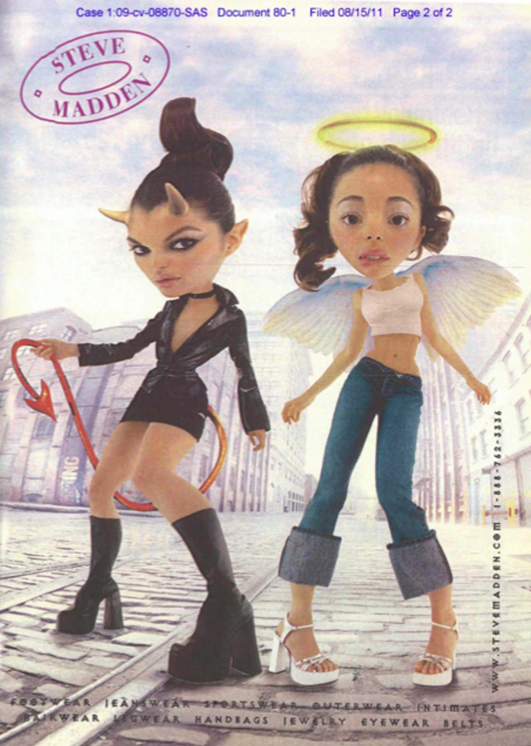
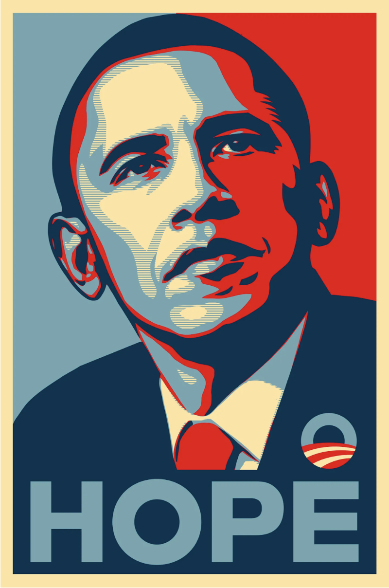
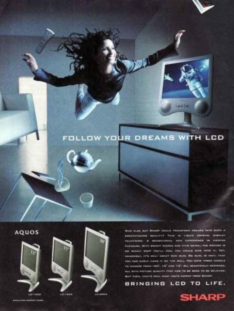
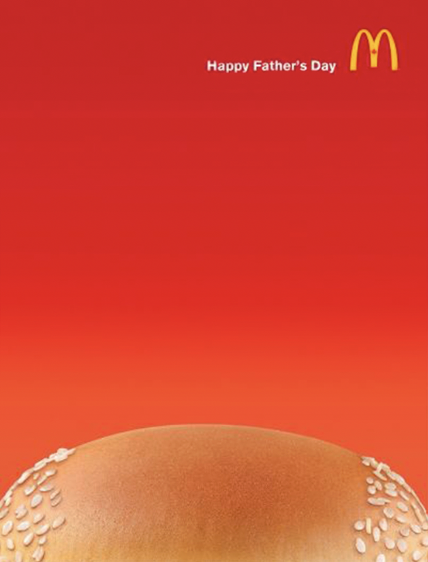
Examples of Ads from the 2000s
2010s
Technology kept developing at a faster rate and during the 2010 decade it played a major role in design. The time to learn was over, people were now masters at Adobe Photoshop, many graphic designers were setting themselves apart from the average everyday Photoshop enthusiasts. This advancement paired with the rise in popularity of the internet made the switch from print to digital even more obsolete. This decade also saw some old styles make a come back! An example would be how the 80s retro was developed to the tone of the 2010’s or when modernist traits form the mid-century were brought back but in a digital form.
This decade saw a larger variety in art styles as technology fostered creativity. Classic 2010 art styles include:
Typography and calligraphy
Low poly, neon colors & long shadow
Double exposure, pastels & lettering
Flat design 2.0
Duotones, geometry & retro wave
Creative Photo Manipulation
3D Effects (using different shades of the same color to emphasize contouring)
Minimalist yet modern
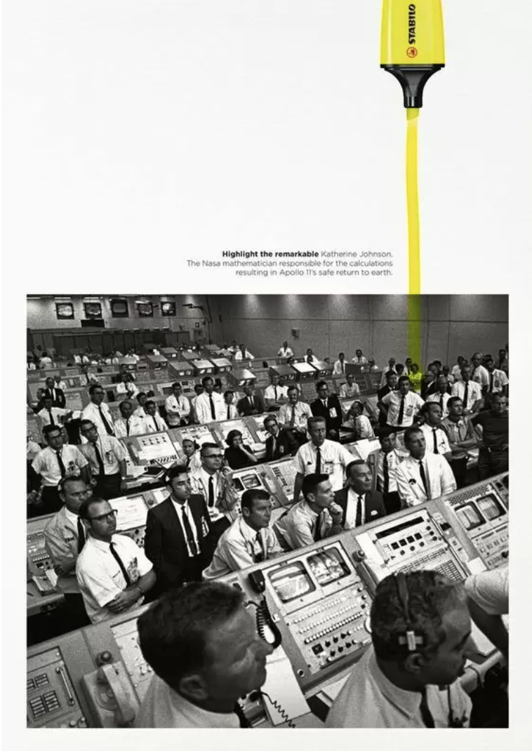
Examples of Ads from the 2010s

2020-Present
At last, we’ve made it to the present. The decade where everything is possible, even naming a baby a random string of characters (*Ahem* @/Elon *Ahem*). At present we are living in a cosmopolitan globe connected by ultra fast internet connections that make the widespread of information possible. As a society we are forward thinking yet we love trends from the past, we’re looking at you Y2K lovers. And, with a global pandemic kickstarting the decade one can’t help but wonder, just how weird of a decade will this be? Well, in terms of graphic it’s not all too weird at least. Graphic design is letting itself be inspired by previous movements but adding its own special 2020 twist on it.
This decade’s graphic design mixology includes:
Risograph Art
Moving Designs
Data Visualization
Anti-Design
90s Nostalgia and Y2K
3D Types and Shapes
Holographic Design
Fonts with a twist
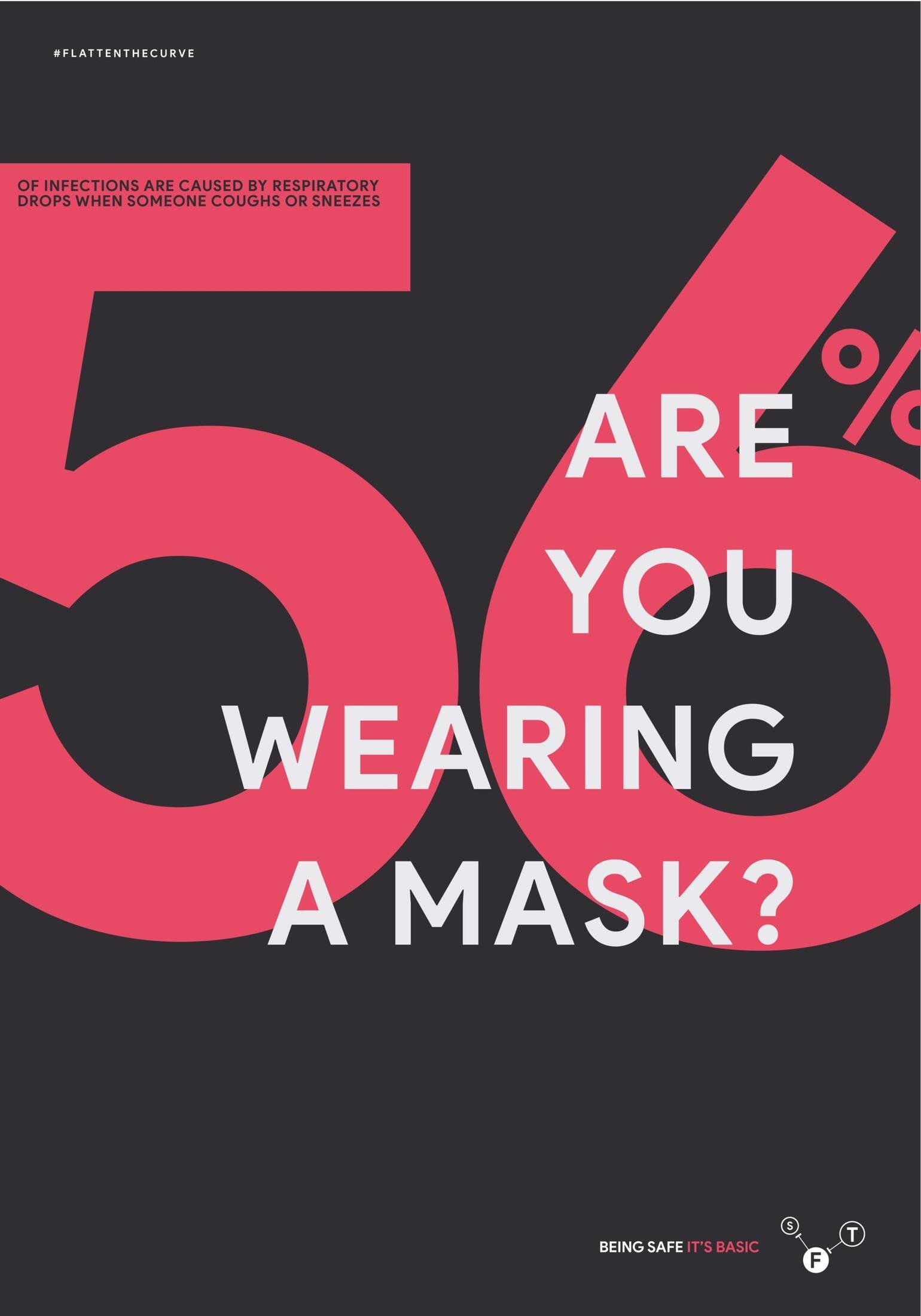
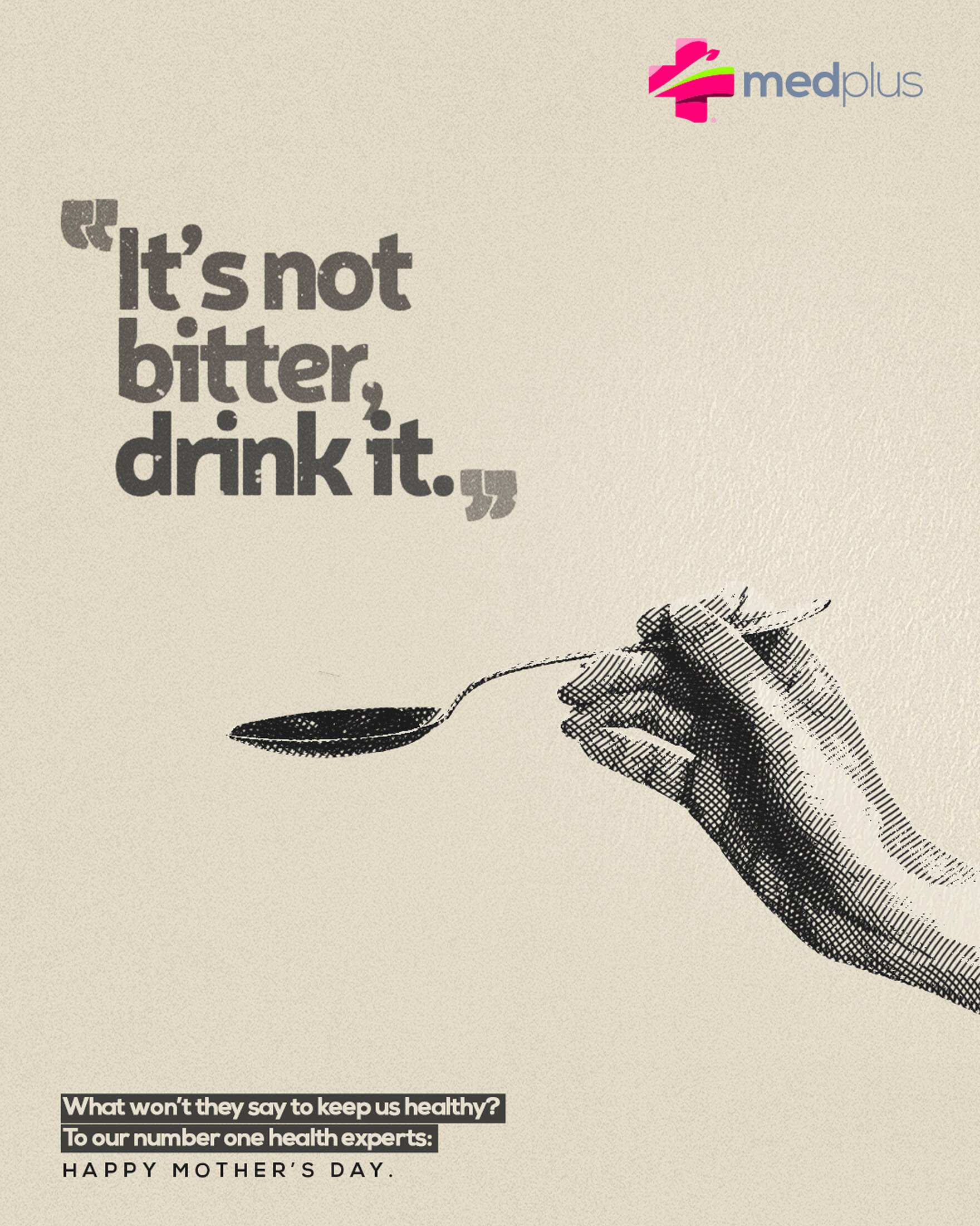
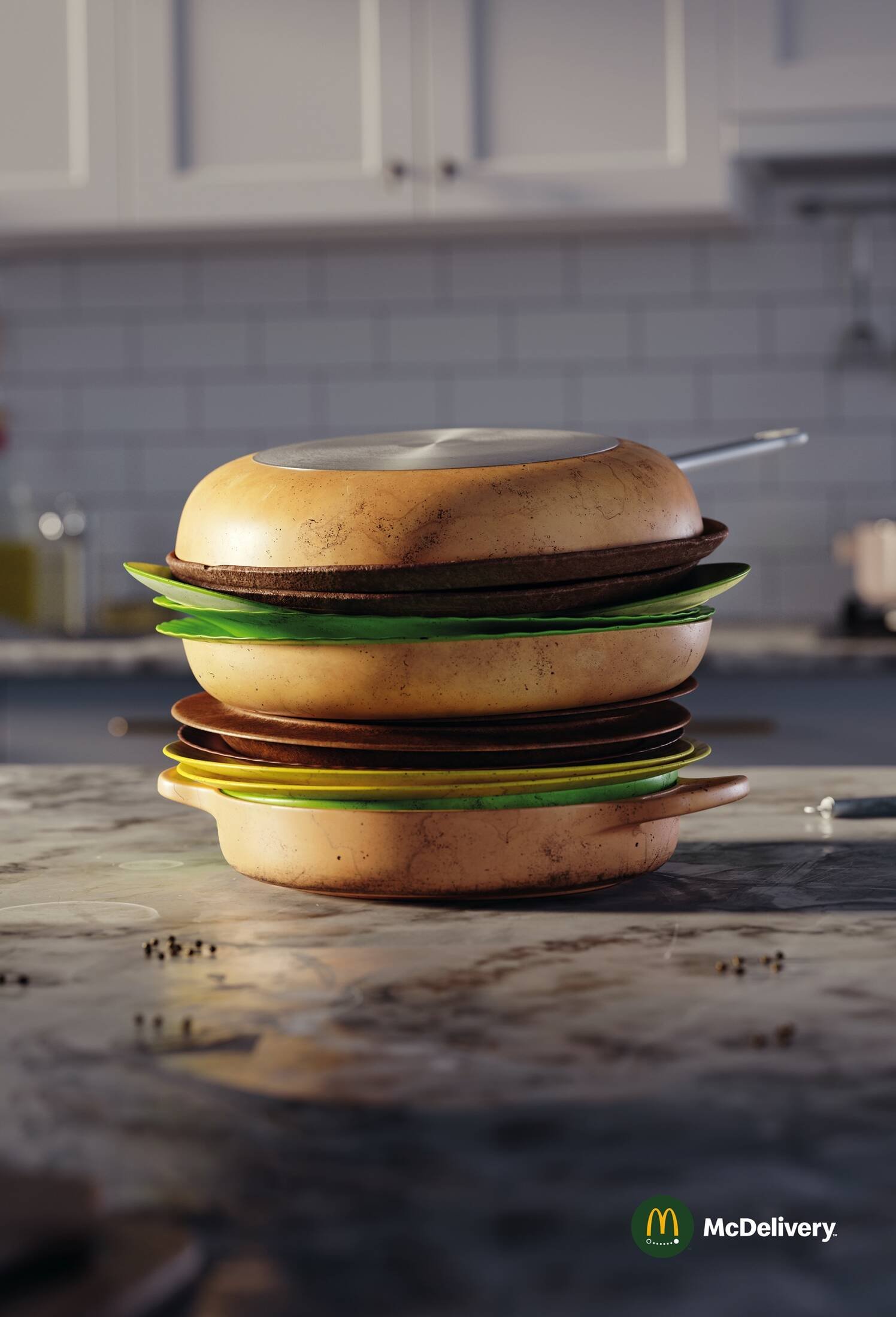
Examples of Ads from the 2020s

Is your media not up to date with today’s trends?
Click HERE to get into contact with our team and take your marketing to the next level!
That's it for this issue of The Power of Rebranding! :) Tune in next week to read on some interesting cases of brand evolution and rebranding